College Work
Created from Fall 2016-Spring 2020.
Summer 2019-Spring 2020
My Senior Thesis: fund
Society is becoming cashless and financial experts believe that holding a debit card or seeing a balance in a bank account does not provide the same tangible, emotional connection as actually being able to count your money. So when children no longer have piggy banks to hold, count, and save, how will we teach them the value of the number on their screen? fund is an app that puts the fun into saving by helping middle schoolers visualize what their bank account balance represents in terms of their savings goals and will help them make choices about when to spend versus save by providing real time visuals for every “what if” they may have.
In addition to the app itself, the deliverables for this assignment were a documentation book, an explanatory video and an exhibition display board. Please view the documentation book here for my research, brand development, thorough explanation of the app, and video storyboard.
This project was completed in AU 2019, but I continued to complete research for it during SP 2020 to complete requirements for a research distinction. This additional thesis work can be found in the University's Knowledge Bank here.
CHAARG
My senior year, I served as the VP Media of The Ohio State University’s chapter of CHAARG. In addition to running all of our social media, I took photos at all of our events and created designs/graphics within CHAARG’s branding. This included shirts and a graduation stole I designed for purchase, and a recruitment video that I filmed and edited to help get new members to join.
Financial Institution Call Center Interface
Summer 2019 Internship Project for a Large Financial Institution
Timeline: 10 Weeks
Team: 2 UX Designers | 1 Design Researcher
My role: UX Designer
Challenge: My team was tasked with combining two complex, separate call center systems into one which works for multiple employee types and is intuitive for all users regardless of employee type or specialization.
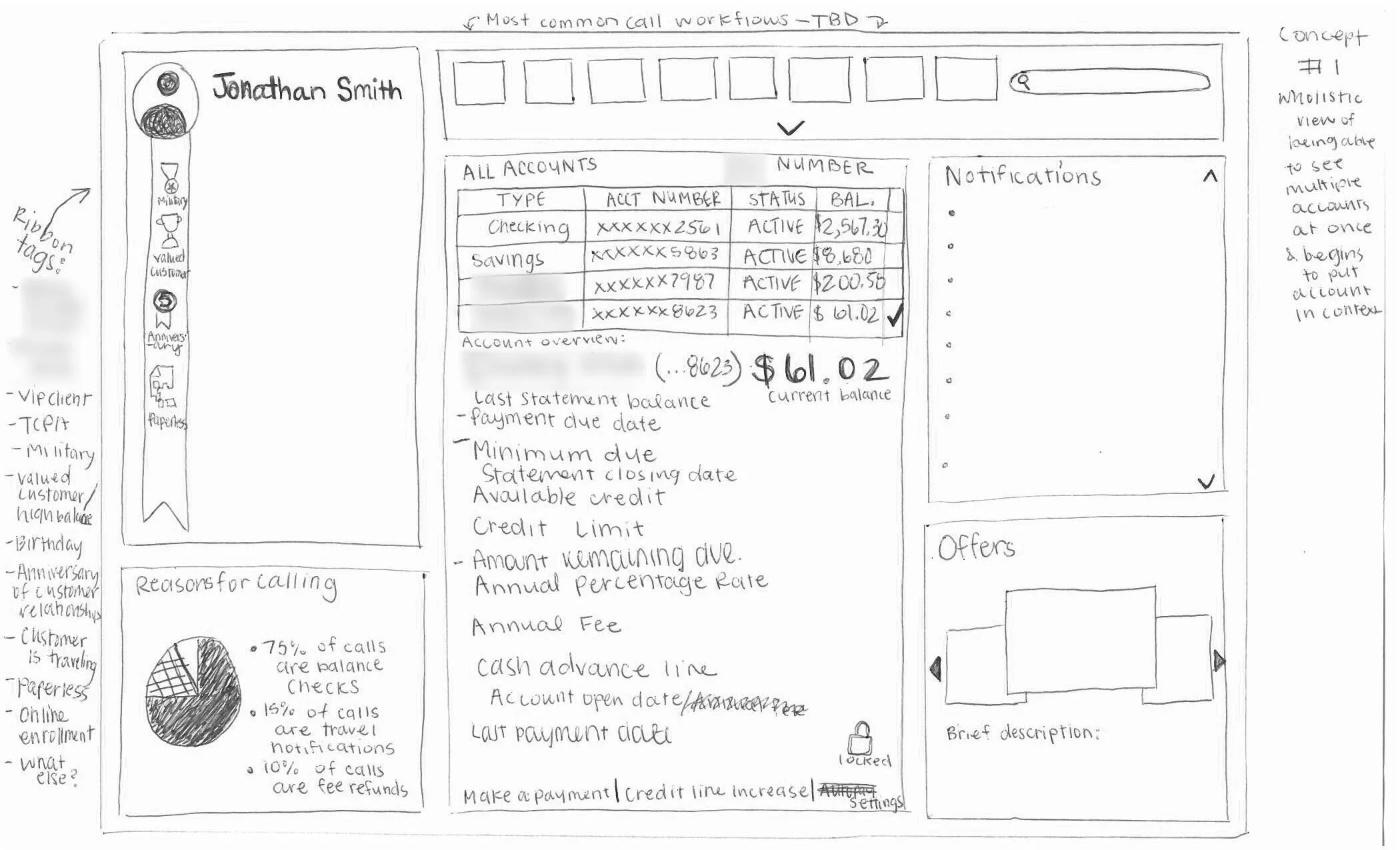
Process: As a team, we listened to calls for 1-2 hours before mind mapping what we knew to discover areas we needed to learn more about and to become aware of our biases.
Keeping in mind pain points we discovered while listening to calls, we individually created sketches of rough layouts prior to generative research sessions.
The researcher conducted generative research to understand current user problems and gain an understanding of an ideal solution to address potential user needs. They guided participants through a generative workshop in which they wrote a breakup letter to their old system, then utilized felt shapes to create their ideal system in groups of two. During this time, my fellow designer and I acted as note takers, paying close attention to what call center employees voiced. After completing all generative research sessions, the researcher coded the data into themes, then affinitized the themes to find salient insights.
My partner and I combined these research insights and parts of our individual sketches to create three main concepts to take to our business partners. Each concept we created focused on a high-level theme found within research. These themes were based upon topics such as: familiarity, information architecture, and visual representation of information overview.
After consulting with business partners, the professional design staff, and the researcher, we used Sketch to create a final concept utilizing the most successful parts from the 3 prior, hand drawn concepts. Then we had business partners and the professional design staff critique this combined concept, and made further refinements based upon this feedback. Before passing it on to the researcher for evaluative testing, we converted our concept into an interactive prototype with clickable features.
The researcher then started to create an evaluative research plan, working closely with us to create scenarios which could be used to test usability with call center employees. The researcher moderated these tests while we took notes in each session. After completing these sessions, the researcher compiled the resulting data and handed it off to my partner and I.
Upon receiving the evaluative research data, we made all the appropriate changes we could within the remainder of the internship timeline before assembling a final presentation with design recommendations.
Outcomes: Upon completing our summer internship, we left the business partners with many assets: a working prototype which was tested to be generally intuitive, a breadth of research which could be expanded upon later, and a list of design recommendations which acted as next steps. Our business partners were very pleased with the outcome of our 10-week project and eager to show the results to higher management.
Fall 2018-Spring 2019
Women's Swimwear Informational Panels
Created in the Spring of 2019 for an Information Design class, these large scale panels are meant to be viewed both together and separate from each other. Panel one discusses the evolution of women’s swimwear, while panel two discusses all of the backlash that came along with the evolution.
tentree: Redefining Retail
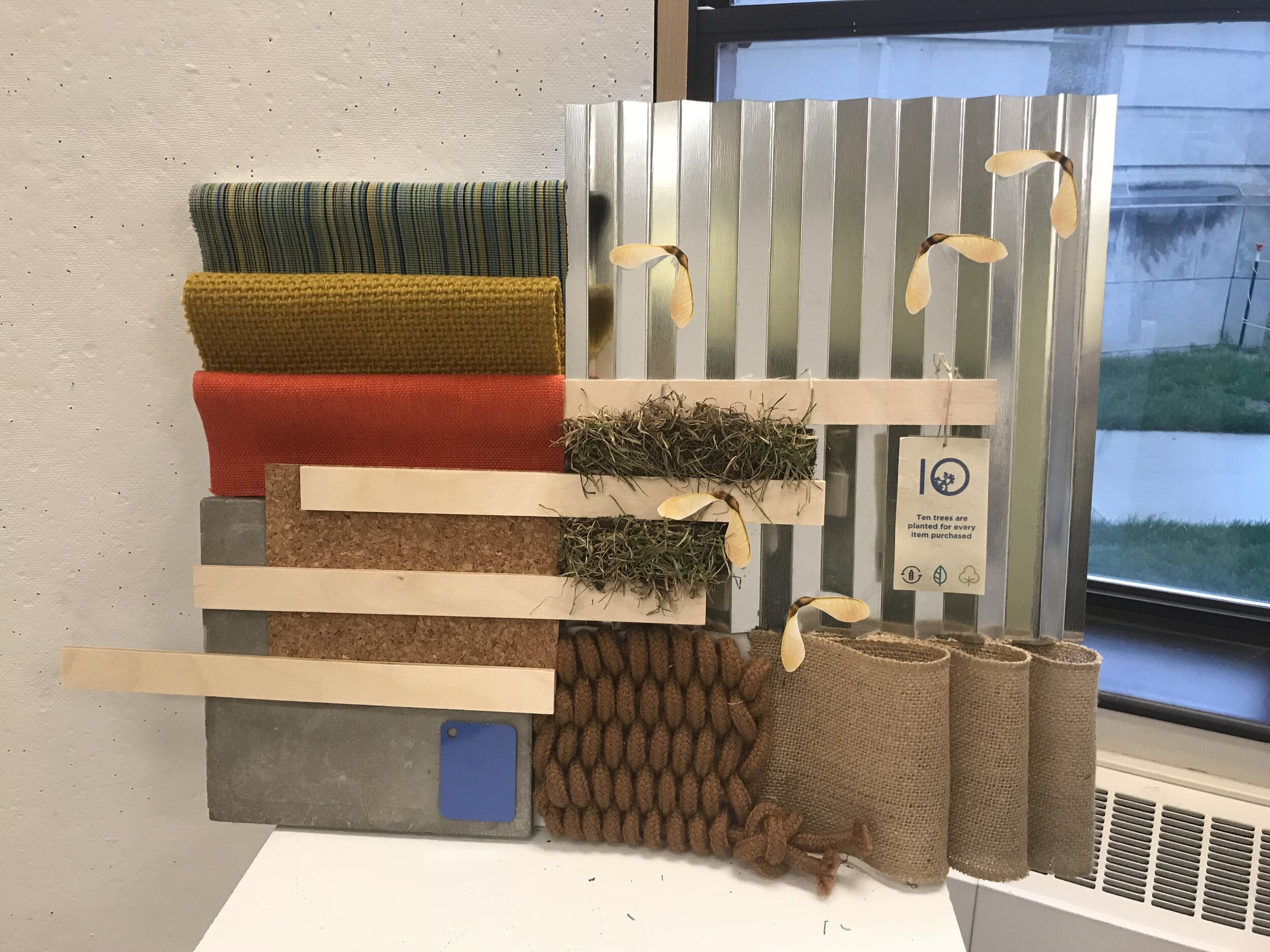
In the Spring of 2019, I had the pleasure of participating in a collaborative studio in which I worked on a team with two interior designers. The studio was aimed at redefining retail and was sponsored by VMSD magazine.
Each team picked an online brand and envisioned what the brick and mortar store experience would be. My team selected tentree, which is an online brand that produces their clothes with sustainable materials and plants ten trees for every product purchased. Our retail concept focused on "sprouting the future," which meant that we wanted to educate the consumer on the product and mission, with a focus on instilling a level of care for the environment in children. We did this through a "educate by play" area on the first floor. Because of this, the entire first floor had no products for sale (which is obviously odd for a store), but this was our vision for the future of retail--an engaging and educational experience. We also wanted to continue the experience once the customer left the store, and we did this by implementing seed paper tags to the clothing so the customer could partake in planting their own tree in addition to the one’s tentree plants. Additionally there is a pop-up tentree truck that would travel to various places where people are enjoying nature such as parks.
As a Visual Communication Design major, this studio was unlike any that I've taken before and I thoroughly enjoyed breaking out of my comfort zone.
BeAnElf.com Rebrand
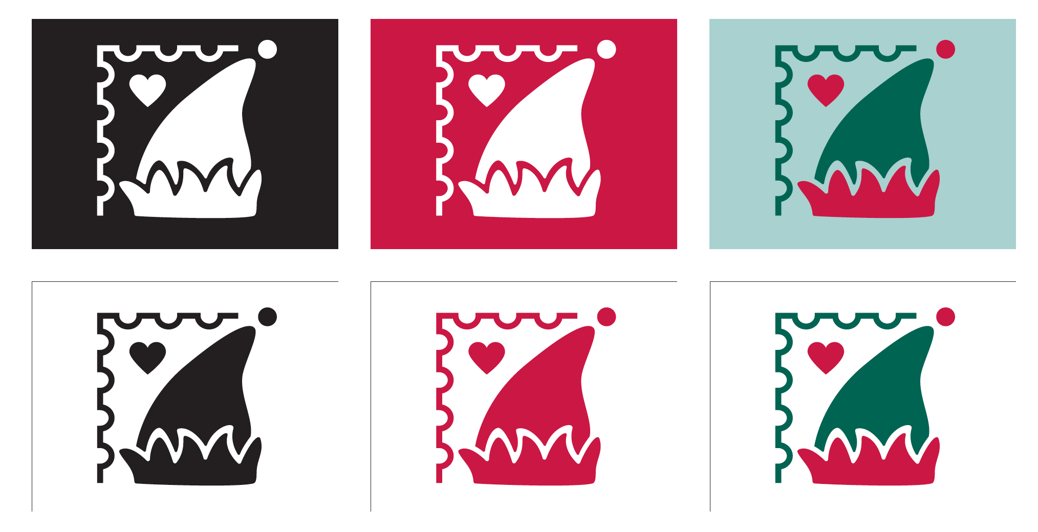
BeAnElf.com helps send deserving/underprivileged children things they have asked for in letters written to Santa. I rebranded them in the Fall of 2018. At first I was experimenting with different ways to represent an elf, but ultimately creating a mark for an organization called “Be an elf,” that didn’t directly reference an elf was not working so I landed on an elf hat. Because it is a program run through the USPS, pulling the boarder of a stamp into the mark was a subtle but important detail and the heart representing charity pulls together the negative space.
Rocky Mountain National Park Informational Animation
Created in Adobe After Effects during the Fall of 2018, this information video discusses the harms of feeding/interacting with animals in Rocky Mountain National Park. All of the assets for the video were created in Adobe Illustrator.
Fall 2017-Spring 2018
Water Crisis Posters
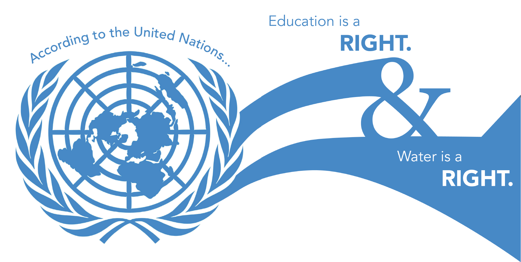
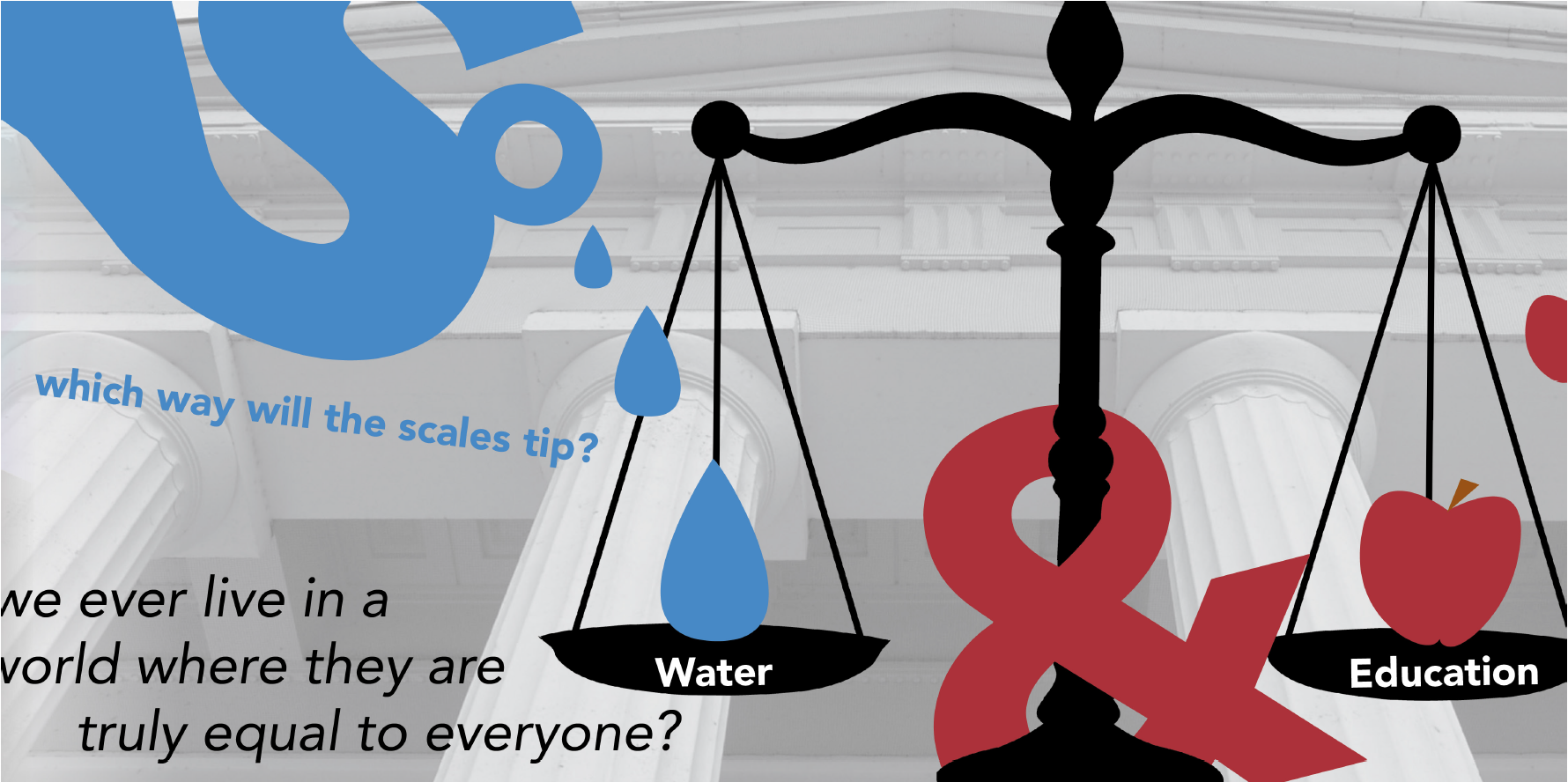
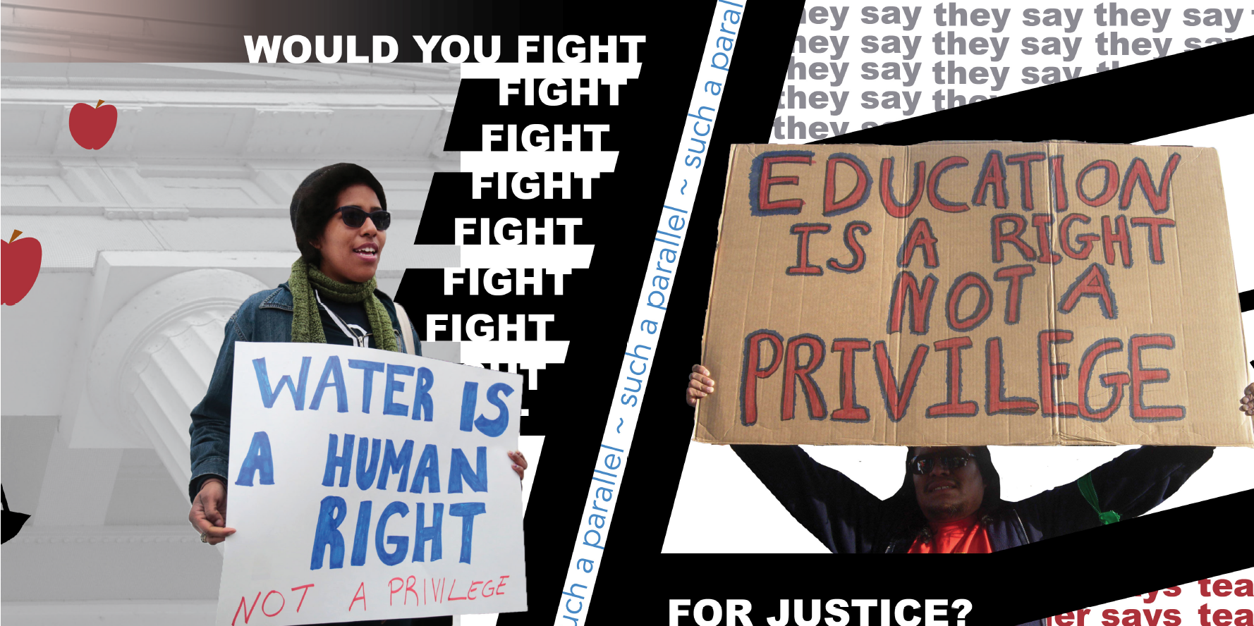
Created in the Spring of 2018, these water posters were meant to address the water crisis in a new way because society has become desensitized to the issue. That being said, I wanted to address education because water and education is not something that most people think of going together. I also had the pleasure of displaying my posters at The Ohio State University’s World Water Day Research Luncheon in March of 2018.
Water + Education Accordion Book
Created in the Spring of 2018, this 12 page accordion book is a continuous narrative that juxtaposes water and education.



Typography Exploration Book
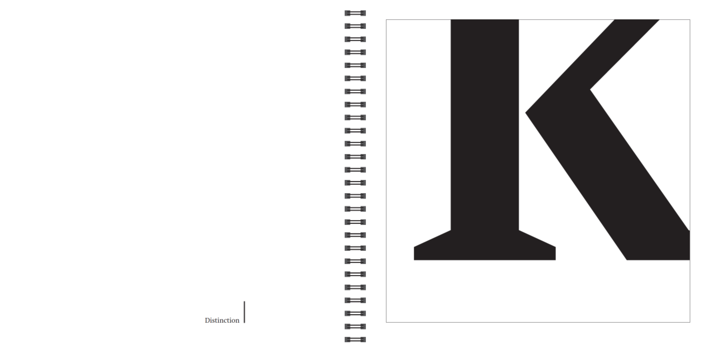
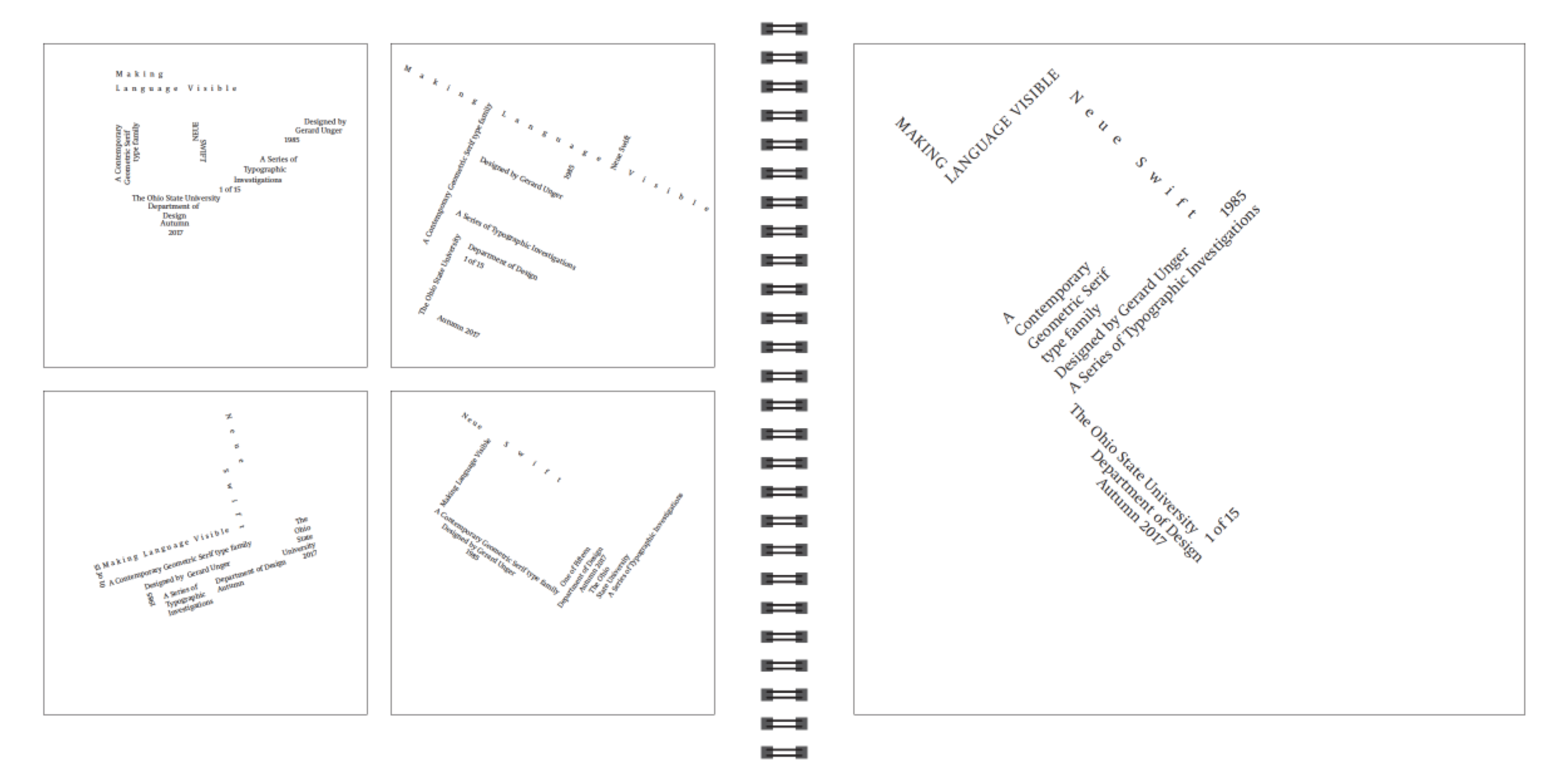
This is a book I created over the course of a semester in the Fall of 2017. It is an in-depth exploration of typography using the typeface Neue Swift.






Kampgrounds of America (KOA) Pictogram Design
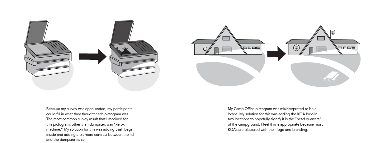
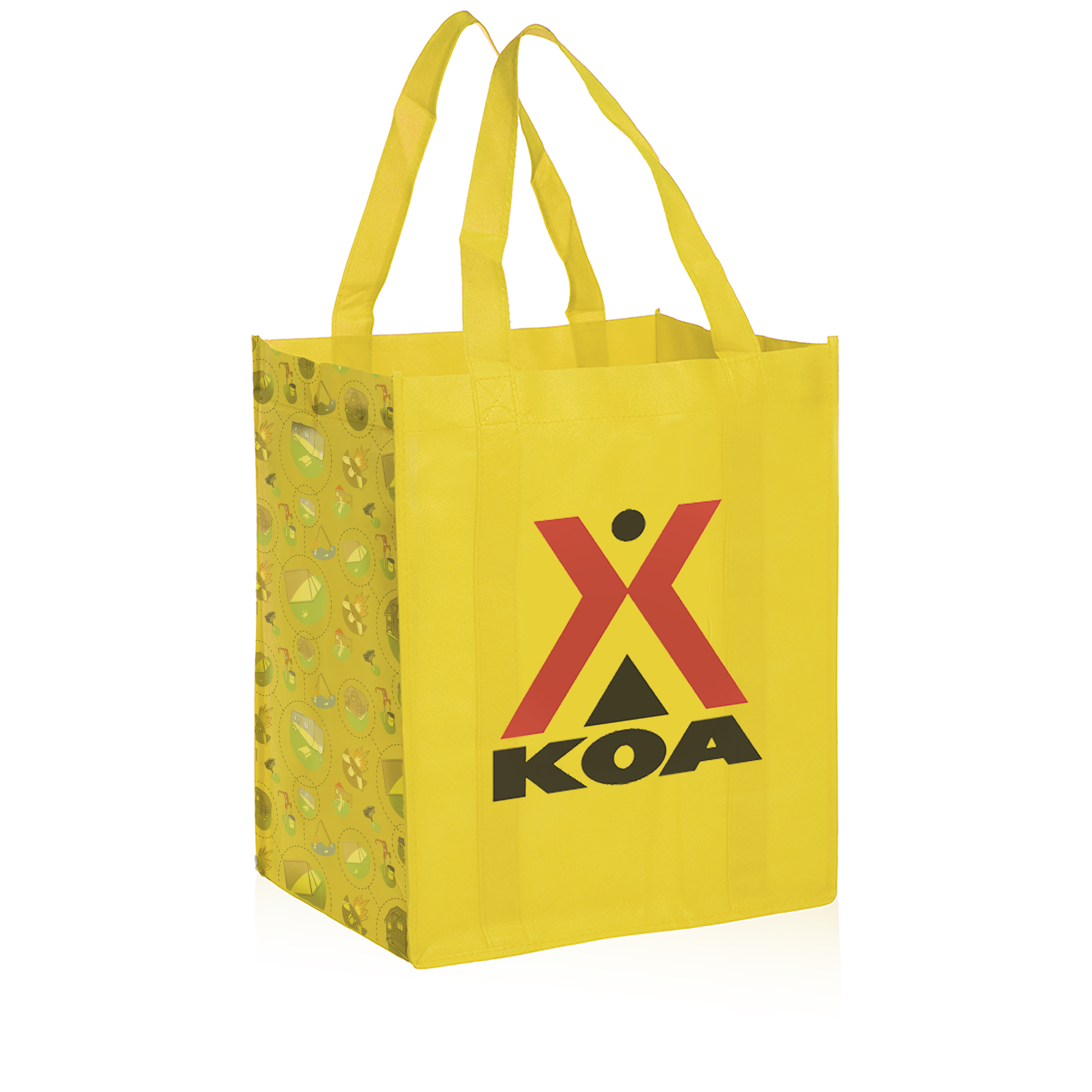
Created in Fall 2017, these pictograms are for Kampgrounds of America (KOA), which is a higher-scale, family-oriented chain of campgrounds. Currently, when an independent campground joins the KOA chain, they aren’t required to change their campground map to KOA branding, so there are a lot of differences between each KOA campground location, even though they are in the same company. My goal was to solve this issue with an all-encompassing set of pictograms.
Fall 2016-Spring 2017
St. Baldrick's Campaign
Created in Spring 2017, this campaign is for the St. Baldrick’s foundation. St. Baldrick’s raises money with the goal of curing childhood cancers by encouraging people to shave their heads and collect money from donors for doing so. This campaign consists of a snapchat filter, a truck that would travel to head shaving events, two magazine pages, and an informational card that salons could pass out.
Package Design
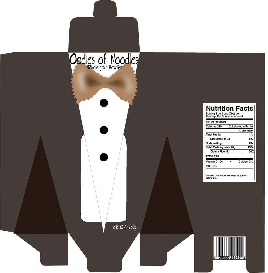
Created in the Fall of 2016, this pasta package design was meant to pop off the shelves of blue and green boxes in the grocery store.


